Data Visualization Notes
Weber’s LawKahneman's ThinkingStephen Few’s Perception - 3Gestalt Principles - 6Tufte’s Principles - 7Munzner's Rules of Thumb - 6

L01 Introduction
-
Definition of Visualization:
- Computer-based visualization systems provide visual representations of datasets to enhance task effectiveness.
-
Purpose of Visualization:
- Augment human capabilities rather than replace decision-making with automated systems.
- Useful when fully automatic solutions are either unavailable or not trusted.
- Helps in exploratory analysis, presentation of known results, requirement assessment, and verification of automatic solutions.
-
Role of External Representations:
- Replace cognitive processing with perceptual processing.

- Visual representations take advantage of the high-bandwidth human visual system, which processes information in parallel and pre-attentively.
- High-bandwidth channel to the brain, providing an overview with background processing.
- Vision supports simultaneous perception of data.
- Sound, touch, taste, and smell have lower bandwidth and less effective record/replay capacities compared to vision.
-
Importance of Representing All Data:
- Summaries may obscure important details.

- Visualizations help confirm expected patterns, discover unexpected ones, and assess statistical models.

-
Resource Limitations:
- Computational: Time and system memory constraints.
- Display: Limited pixels and the need to balance information density with visual clutter.
- Human: Limitations in time, memory, and attention.
-
Why Analyze Visualization Designs:
- Provides structure to a vast design space.
- Helps systematically evaluate choices and design new solutions.
- Analyzing existing visualizations can inform new design approaches.


L02 Nested Model

Here’s the three-part framework for visualization design:
- What:
- Identify the data to be visualized.
- Determine data types (e.g., categorical, quantitative) and attributes.
- Example: For a sales dashboard, specify metrics like sales volume, revenue, and profit.
- Why:
- Define the purpose of the visualization.
- Understand the goals and needs of the end-users.
- Example: If tracking sales performance, reasons might include monitoring team effectiveness or evaluating new product success.
- How:
- Decide on design methods and choices for visualization.
- Choose encoding techniques, interactivity, and layout.
- Example: Use a bar chart for comparing sales volumes or a line graph for revenue trends.
-
Analysis Framework: Four Levels
- Domain Situation
- Who are the target users?
- Abstraction
- Data Abstraction: What is shown?
- Task Abstraction: Why is the user looking at it?
- Idiom
- Visual Encoding Idiom: How to draw?
- Interaction Idiom: How to manipulate?
- Algorithm
- Efficient computation.
- Domain Situation
-
Nested Model
- Downstream: Cascading effects.
- Upstream: Iterative refinement.

-
Validation Challenges
- Different ways to get it wrong at each level.
- Solution: Use methods from different fields at each level.

-
Avoiding Mismatches
- Computational benchmarks may not confirm idiom design.
- Lab studies may not confirm task abstraction.


L03 Data Abstraction
- Data Types and Meaning
- Data types include items (individual entities), attributes (properties measured), links (relationships between items), positions (spatial data), and grids (sampling strategies).
- Items are discrete entities like patients or cars; attributes are measured properties like height or horsepower.
- Links express relationships; positions denote spatial locations; grids are used for sampling continuous data.
- Data types include items (individual entities), attributes (properties measured), links (relationships between items), positions (spatial data), and grids (sampling strategies).
- Dataset Types
-
Flat tables organize data with one item per row and attributes as columns.
-
Multidimensional tables index data by multiple keys (e.g., genes, patients).
-
Networks/graphs connect nodes with links; trees are a special case without cycles.
-
Node-link diagrams
–Force-directed Placement (Links = springs pull together, Nodes = magnets repulse apart)

–Circular layouts

–Arc diagrams

-
Adjacency matrix representation

-
Enclosure (specific to trees)
–Treemaps
–Sunburst
–Icicle plot

-
-
Spatial

Fields (continuous) - Represent continuous attribute values associated with cells in a grid.
- major concerns – sampling: where attributes are measured – interpolation: how to model attributes elsewhere – grid types
- major divisions – attributes per cell: scalar (1), vector (2), tensor (many)
-
Geometry (spatial) - Represents the shape and spatial position of items.
- Choropleth maps

- Symbol maps

-
Cartograms – Continuous cartograms

– Grid cartograms

-
Dot density maps

-
Collections
- sets
- lists
- clusters
-
- Data Abstraction
- Involves translating domain-specific language into a generic visualization format.
- Identifies dataset types, attribute types, and cardinality (number of items and attributes).
- Considers data transformation based on task requirements.
- Attribute Types
- Categorical (nominal) for equality comparisons.
- Ordered (ordinal) for meaningful order comparisons.
- Ordered (quantitative) for measurable magnitude and arithmetic operations.
- Data vs Conceptual Models
- Data models are mathematical abstractions; conceptual models are mental constructions supporting reasoning. – 32.52, 54.06, -14.35, ...; temperature.
- Data abstraction processes rely on conceptual models for data transformation.
- Derived Attributes
- Computed from original data through simple changes, additional data acquisition, or complex transformations.


L03 Task Abstraction
-
Identify tasks users need or perform.
-
Find or transform data types to support these tasks.
-
Task Abstraction: Actions and Targets:
- Action Types:
- Analyze: Consume (discover vs. present), Enjoy (newcomer vs. casual), Produce (annotate, record, derive).
- Search: Lookup (e.g., dictionary), Locate (e.g., keys), Browse (e.g., bookstore), Explore (e.g., new city).
- Query: Determine how much data matters (one, some, all).
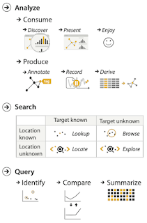
- Targets: What is being acted on.

- Action Types:


L05 Marks & Channels
-
Visual Encoding:
- Analyze idiom structure through marks and channels.
- Marks: Represent items or links (e.g., points, lines, areas).
- Channels: Control the appearance of marks based on attributes.
-
Marks for Items:
- Basic geometric elements: 0D (point), 1D (line), 2D (area).
- 3D marks (volume) are rarely used.
-
Marks for Links:
-
Links can be represented using lines or areas.

-
-
Channels:
- Control the appearance of marks (e.g., size, color).
- Channel properties differ in the amount and type of information conveyed.
- Types of Channels:
- Position: Vertical, horizontal.
- Color Hue: Represents categorical differences.
- Size (Area): Encodes quantitative information.
-
Redundant Encoding:
- Using multiple channels can strengthen the message but consumes more channels.
-
Marks as Constraints:
-
Geometric primitives (points, lines, areas) impose constraints on how data can be encoded.
– points: 0 constraints on size, can encode more attributes w/ size & shape – lines: 1 constraint on size (length), can still size code other way (width) – interlocking areas: 2 constraints on size (length/width), cannot size or shape code

-
-
Channel Effectiveness:
- Accuracy: Precision in differentiating encoded items. (length is accurate)
- Discriminability: Number of unique steps perceived.

- Separability: Ability to use a channel without interference from others.

- Popout: The ability for items to stand out visually.

-
Factors Affecting Accuracy:
- Alignment, distractors, distance, common scale.
-
Relative vs. Absolute Judgements:
- Perceptual system relies on relative judgments rather than absolute.
- Accuracy improves with common frame/scale and alignment.
- Weber’s Law:
- Ratio of increment to background is constant, affecting how differences are perceived.
- Relative Luminance and Color Judgements:
- Luminance perception is contextual based on contrast.
- Color constancy maintains perception across varying illumination conditions.


L06 Visual Thinking Process (Perception, Cognition, Attention)
Kahneman's Fast and Slow Thinking
- System 1:
- Fast, unconscious, automatic
- No self-awareness or control
- 98% of our thinking
- Intuitive, automatic functions like reading faces
- System 2:
- Slow, conscious, deliberate
- With self-awareness and control
- 2% of our thinking
- Analytical, logical functions like solving math problems
Perception Insights
- Stephen Few’s Visual Perception:
- Selective; sensitive to contrast and change.
- Drawn to familiar objects.
- Limited short-term visual memory.
- Pre-attentive Perception:
- Immediate, primal reaction.
- Post-attentive Perception:
- Slower, conscious activity.
Gestalt Principles for Data Visualization
- Similarity:
- Elements with shared visual properties are considered in the same group.
- Proximity:
- Elements close to each other are grouped.
- Enclosure:
- A visual element surrounds related elements.
- Common Fate:
- Shapes moving in the same direction are grouped.
- Parallelism:
- Lines with similar slopes are grouped.
- Connectedness:
- Elements that are visually connected are grouped.
L09 Interactive Views
Complexity Handling in Data Visualization

- Manipulate Views
- Change Over Time: Adjust encoding, parameters, arrangement, and aggregation.
- Re-encode
- Change Parameters: Use widgets such as sliders, buttons, and checkboxes
- Change Order/Arrangement: Reorder data to find extreme values or correlations
- Change Alignment: Align bars for flexible comparison
- Animated Transitions: Smooth transitions between states to aid in tracking
- Selection: Basic operation with choices for click/tap vs. hover, multiple click types, and interaction semantics.
- Highlighting: Change visual encoding to provide feedback on selection; use channels like color, size, or motion.
- Navigate
- Scrollytelling: Navigating by scrolling; familiar but can lack affordances and direct access.
- Change Viewpoint/Visibility: Pan, zoom, rotate, and slice; adjust to show specific items or attributes.
- Unconstrained vs. Constrained Navigation: Unconstrained is easier to implement but harder for users; constrained uses animations and computed trajectories for better control.
- Change Over Time: Adjust encoding, parameters, arrangement, and aggregation.
Interaction Benefits & Limitations
- Benefits: Flexible, powerful, intuitive; supports exploratory data analysis and fluid task switching.
- Limitations: Time cost, cognitive load, screen space, and potential for unplanned user interactions.
- Multiple Views/ Facet
-
Partition data into views to compare; use linked highlighting for coordination.
-
Juxtapose
- Overview-Detail Views/ Navigation: Display detailed and overview information with bidirectional or unidirectional linking.
- Google Maps
- Tooltips: Provide additional details on hover or click but do not support overview.
- Small Multiples: Display multiple similar charts to compare data across attributes or time.

- Overview-Detail Views/ Navigation: Display detailed and overview information with bidirectional or unidirectional linking.
-
Partitioning & Recursive Subdivision
- Partitioning: Split data by attributes or regions.
- Recursive Subdivision: Divide data hierarchically, with variations in order and encoding to reveal patterns.
-
Superimpose Layers
- Layer objects within the same view; use color and design choices to distinguish layers.
- Static Visual Layering and Dynamic Visual Layering
-

L11 Principles of Effective Information Visualization
Tufte’s Principles
- Show Data
- Focus on data itself, avoid unnecessary embellishments.
- Examples: Clean charts, appropriate scales, minimal decoration.
- Maximize Data-Ink Ratio
- Use ink only to represent data.
- Remove non-data ink and redundant elements.
- Formula: Data Ink Ratio = Data Ink / Total Ink Used
- Mantra: Show the data, maximize data-ink ratio, erase non-data ink.
- Use Effective Data Density
- 𝐷𝑎𝑡𝑎 𝐷𝑒𝑛𝑠𝑖𝑡𝑦 = 𝑁𝑢𝑚𝑏𝑒𝑟 𝑜𝑓 𝑒𝑛𝑡𝑟𝑖𝑒𝑠 𝑖𝑛 𝑑𝑎𝑡𝑎 𝑚𝑎𝑡𝑟𝑖𝑥 / 𝐴𝑟𝑒𝑎 𝑜𝑓 𝑑𝑎𝑡𝑎 𝑔𝑟𝑎𝑝ℎ𝑖c
- High data density displays more information efficiently.
- Examples: Small multiples, sparklines.
- Balance data density with clarity.
- Provide Context and Comparisons
- Add context and benchmarks for better understanding.
- Examples: Historical trends, comparative data.
- Ensure Integrity and Accuracy
- Represent data faithfully; avoid distortion.
- Lie Factor: Measures distortion (Size of effect shown in graphic / Size of effect in data).
- 𝑆𝑖𝑧𝑒 𝑜𝑓 E𝑓𝑓𝑒𝑐𝑡 = |𝑆𝑒𝑐𝑜𝑛𝑑 𝑣𝑎𝑙𝑢𝑒 −𝐹𝑖𝑟𝑠𝑡 𝑣𝑎𝑙𝑢𝑒| / 𝐹𝑖𝑟𝑠𝑡 𝑣𝑎𝑙𝑢e
- Encourage Exploration and Interactivity
- Use interactive elements to allow deeper insights.
- Examples: Interactive dashboards, zoomable charts.
- Design for Universal Accessibility
- Make visualizations accessible to all, including those with disabilities.
- Examples: Alternative text, color-blind friendly schemes.
Munzner's Rules of Thumb
- 3D vs 2D: Use 2D unless 3D has clear justification.
- Reasons: perspective distortion, occlusion, text legibility
- Eyes vs Memory: Use side-by-side views for comparison.
- Immersion vs Resolution: Resolution is more important than immersion for abstract data.
- Overview First, Zoom and Filter, Details on Demand: Start with an overview, then zoom in for details.
- Responsiveness is Required: Ensure visualizations respond quickly.
- Function First, Form Next: Prioritize functionality over aesthetics; aesthetics can be refined later.


Comments
Post a Comment